Dec 10 2013

Using Content Security Policy From a <meta> tag

Here's an esoteric little discovery. You probably won't find yourself in this situation — but if you do, maybe I can save you hours of struggle.

Content Security Policy is a good thing for web security. If you're not familiar with CSP yet, here's a great introduction.

You can also use CSPs to disable browser features in situations where you don't have much control. I just found myself wanting to do that, to prevent javascript from executing in small, locally stored bits of HTML that need to be rendered inside a UIWebView in a native iOS app. There are other ways to solve that problem, but like me, you might find that you wish to avoid parsing and modifying the markup directly.

You'll find some advice on the web to disable JS by subclassing NSURLProtocol and adding the CSP header via the URL loading system. This approach has a big disadvantage: it forces you to use UIWebView's -loadRequest: method, which asynchronously begins the load on a background thread. WebKit rendering is always asynchronous, nothing you can do about that. But if you use -loadHTMLString:baseURL:, in practice you'll see much shorter delays before your content is fully rendered.

Luckily, it turns out there's another way to set the policy: use a meta tag. As of iOS 7.0, this tag will be respected:

<meta http-equiv="Content-Security-Policy" content="script-src none">

So prepend that to your markup and you should be set. I haven't tested, but suspect this will work in iOS 5.0 and later. (If you know for certain, let me know and I'll update this post).

There are a bunch of other policy directives. Maybe there are other interesting ways to modify content rendering. If you find one, I'd be interested in hearing about it.
Nov 21 2013

We raised money for the EFF & ACLU with an NSA t-shirt :)

Note: If you'd still like a shirt, Charles Marshall has re-created the campaign (and did a better job of it, with more sizes and women's cuts!). Donations on the same terms. Get it here: SSL added and removed here t-shirt

So a few weeks ago my officemate Choong and I had a quick idea for a t-shirt. We put them online via Teespring and promised to donate any earnings to the ACLU and EFF.

Most people who ordered a shirt should have one by now. Mine came in the mail earlier this week and they printed up great (still need one? See below).

The shirt is a real thing that exists

In a stroke of genius, someone on Twitter also took the vector art and made a mug, crossing out "SSL" in red and writing in "coffee."

Anyway, here's how things ended up:

Breakdown

  • 142 shirts were sold
  • For $20/each
  • Teespring adjusts its cost per shirt based upon the number that must be ordered before the shirts will be printed. We set 25 shirts as the threshold, which translated to them charging about $10.18/shirt.
  • That's about $9.82/shirt in profit, or $1,394.09 in total.
  • You've got to get the money out of Teespring somehow in order to do anything with it. I chose PayPal since it's much faster than being mailed a paper check and then (without telling me ahead of time) PayPal charged $40.73 to make the transfer.
  • So after fees, proceeds were $1,353.36.

Donation

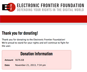
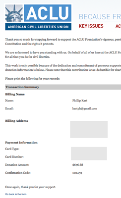
I split the amount evenly between the ACLU Foundation and the EFF, donating $676.68 to each. That felt great! Thanks to everyone that bought a shirt!

ACLU donation confirmation EFF donation confirmation

Second round

I received a few emails, and a bunch of people tweeted that they wanted a shirt but missed the sale. So it's back online for a second round, on Teespring again. There are about 6 days left to buy, so if you want one, get it here:

(Update: It's over now. The page was here: round 2 t-shirt page. See the top of this post for ongoing t-shirt sales)

Once this sale ends, I think I'm done with this project. But the vector art I posted before will stay online, so it should be permanently as easy as possible to print up your own.

:)

Update:

The second t-shirt sale concluded in early December. 81 t-shirts sold. Per-shirt proceeds were the same as before. Avoiding PayPal the second time meant there weren't any transfer fees and earnings totalled $788.54. I sent another $394.27 to the EFF and the ACLU foundation. Thanks again, t-shirt buyers! Here's hoping for the vigorous defense of Internet freedom in 2014.

Oct 30 2013

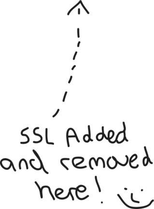
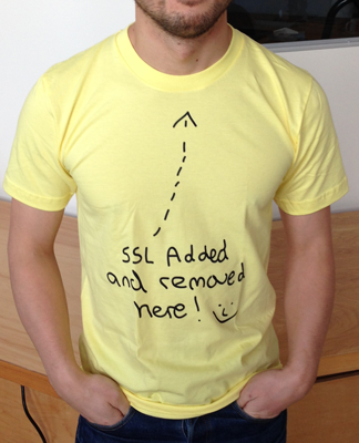
<----- SSL Added and Removed Here! :)

Some things just cry out to be put on a t-shirt. The Washington Post reported this morning that the NSA and GHCQ have been surveilling internal network traffic from Google and Yahoo, without those companies' permission.

In a year of disturbing revelations about surveillance by the US government on its own citizens, this has got to be one of the worst. I'm personally quite upset by it.

Hang on. Can we talk about that slide for a minute?

Slide from an NSA presentation published by the Washington Post

This afternoon in the office we realized the message and smiley face would be perfect on a shirt. Wear an intrusion into your privacy on your chest and raise awareness of the issue.

We quickly put together a shirt on Teespring in the closest thing they had to fake-sticky-note yellow: American Apparel Lemon.

Get it here

Teeshirt preview

The price is set at $20 bucks, about $9 more than the price of the shirt. It seems like a dick move to profit from something like this, so any proceeds from shirt sales will be donated to the ACLU and EFF.

Here's a link to vector art for the "SSL added and removed here" phrase, smiley, and arrow. It would be great to see this meme spread to other places:

Vector art

ssl-smiley.eps

Aug 06 2013

Timed Repetition Art

Just came across this art project: FACETS. It's a project of illustrator Justin Maller. Every day this year, he's creating and posting an illustration.

It's a great illustration of the power of timed repetition and multiples. On their own, most of these frames wouldn't amount to much. Together the effect is stunning.

I especially like the mini-themes that emerge, like these:

Mar 10 2013

Two Quotes

Recently I realized that both of these quotes have been lodged in the back of my mind ever since I first saw them.

First, David Pogue, from "The Lessons of 10 Years of Talking Tech."

Things don't replace things; they just splinter. I can't tell you how exhausting it is to keep hearing pundits say that some product is the "iPhone killer" or the "Kindle killer." Listen, dudes: the history of consumer tech is branching, not replacing.

TV was supposed to kill radio. The DVD was supposed to kill the Cineplex. Instant coffee was supposed to replace fresh-brewed.

But here's the thing: it never happens. You want to know what the future holds? O.K., here you go: there will be both iPhones and Android phones. There will be both satellite radio and AM/FM. There will be both printed books and e-books. Things don't replace things; they just add on.

Pogue is right, but neglects to mention that this does not mean consumer technologies live forever. They fade and die -- it's just usually due to internal forces, not the emergence of some new category-killer.

Second, Jason Scott in late 2010, just after Yahoo! announced it would kill off lots of stuff. (The whole post is worth reading, this is just the sum-up.)

All I can say, looking back, is that when history takes a look at the lives of Jerry Yang and David Filo, this is what it will probably say:

Two graduate students, intrigued by a growing wealth of material on the Internet, built a huge fucking lobster trap, absorbed as much of human history and creativity as they could, and destroyed all of it.

Great work, guys.

These are the two things the Internet is about: splitting and forgetting.

This is great news if you're starting a company. Splitting means others doing the same thing are no problem -- you'll just carve out your own niche! Forgetting means that they're most likely on their way out, anyway. Or will be soon enough.

On the other hand, if you are hoping for some kind of progress, things are not so bright. The twin forces of splitting and forgetting mean that no problem is solved for good, and future attempts will be mostly ignorant of work done in the past. Attempts to add to human knowledge will be foiled by time. In the future, only the currently popular will survive.

Aug 10 2012

Sketching

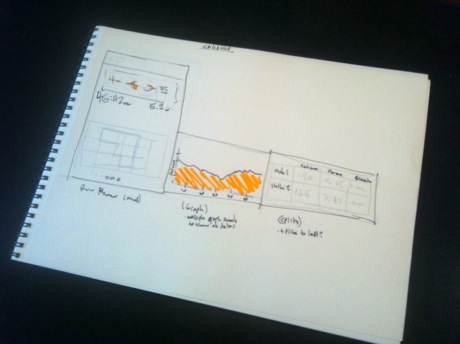
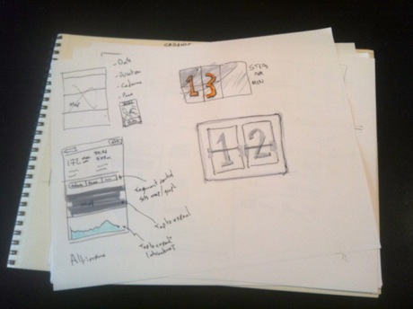
For a long time now I've been sketching interfaces before I start to build them. Until recently, that just meant a little notebook or scratch paper and a pencil or fine tip pen. That worked OK, and it's great for getting ideas down or trying to figure out how things should fit together.

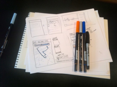
Markers on sketch pad

A few weeks ago, I decided to step up my prototyping and sketching game for a new app I'm working on. I tried a few of the popular digital prototyping tools, like the Teehan+Lax template, and Balsamiq. None seemed like much of a win. Since I don't typically use a lot of sliced images to create interfaces (preferring to draw by hand wherever possible), doing everything in Photoshop doesn't make a ton of sense. And if the idea is to block out a rough idea of what things will look like, paper is much quicker than dragging and dropping.

So, I decided to make better sketches. There are plenty of articles on sketching technique out there, showcasing styles from messy to obsessively neat and detailed:

That first article in particular has some helpful stuff. Photocopying and redrawing layers on a sketch might be going a little far, but the light marker washes and use of color look great. I decided to get some markers. Copic markers are very popular. I ended up going with Tombow dual-brush pens, which are stocked at the art store down the street and have a long flexible brush tip that's fun to use.

So far, I wouldn't say I'm a very skilled sketch artist. But it's coming along, and the ability to layer color, starting very light then filling in helps think through how a screen should be laid out, much more than I expected. Adding a color palette can add a little time, but doesn't by itself get you all the way to fussy-sketch land, where you lose sight of the things you're trying to figure out and get diminishing returns. In fact, it can be a little quicker -- with those big brush tips, you can make rough initial sketches much faster than with, say, a pencil.

Jun 01 2012

How many apps are in the Top 200?

The Top 200

How many apps are in the iOS App Store's top 200 lists? That might seem like a silly question: 200, duh. But even a quick glance through the list shows that they aren't all unique. The most popular app concepts have multiple top-selling implementations competing.

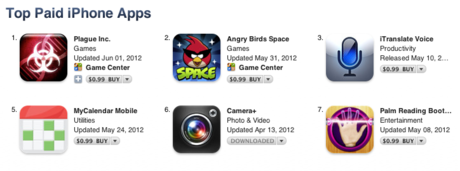
I was curious just how much duplication there was, so this afternoon I sat down and figured it out. I grabbed a copy of the Top 200 iPhone Paid Apps list at around 2:30pm, and categorized them all. The list is always changing (these days, it seems to update at least every 5 min), and there's no one correct way to make the categorization (you could lump or split more). I grouped all games and game-like entertainment apps (Pocket God and the like) together. A categorization of games might be interesting and they are a huge part of the app marketplace, but I don't understand them well enough to know which might be groupable. With those caveats, the answer is:

There are 46 unique non-game apps and 108 games.


That's even fewer than I expected. Emoji extenders are the most repeated app with 8 implementations. If you're a good icon designer and marketer, it might not be a bad idea to throw your hat in the ring. After that come photo editors (5 apps, including PicFX, Color Splash and iPhoto) and download managers, photo booth apps (Fat Booth and friends), and map replacements with 4 apps each.

One thing that stands about the results is just how popular apps replace or extend a built-in app's functionality. Four map replacements (most do turn-by-turn navigation), 3 camera replacements, 3 clock replacements, 3 weather forecast apps, as well as music downloaders (3) and radio players (1) which are partial Music app replacements. There's good money to be made if you can find a new twist or a way to extend one of the apps that came with your iPhone.

Here's the full table:


This is a pretty superficial analysis. There's a lot more that could be done, from categorizing games to looking at the difference between free/paid/grossing lists, to looking at popular apps within a category and comparing category diversity. I may take this further, and if I do, I'll update this post with links to my findings.

Dec 09 2011

Reset

If you're reading this, then I've trashed the wreckage that was my Posterous site and replaced it with my own creation. (More on how the site is built soon).

Long ago, Seth Godin did this categorization of blogs, which I've always liked.^1 Well, according to his categories, I've always created a cat blog: a little public diary of things I've done. After trying that for a decade or so, it's pretty clear that I'm just no web diarist. Which is fine; that's what twitter is for.

This time I'm trying a different approach. This site is going to publish occasional writing about the Internet, programming, startups, and the tech industry. It will also be the mouthpiece for updates on my work and the products I create. In other words, topics that might actually have an audience.

Stay tuned...